Showing posts with label Atlanta Thrashers. Show all posts

Mar 9, 2009

THE MOST PROLIFIC SCORER IN OHL HISTORY

Last night, John Tavares of the London Knights scored three goals, giving him 215 for his career in the Ontario Hockey League. Tavares passed Peter Lee, who's 213 goals were the most anyone had ever scored in the OHL, until Tavares came along. The record, now his, would not have been broken without another outstanding season from the 19-year-old, with 58 goals and 104 points so far this year. He has 2 more games this season, which is sure to be his last in the OHL.

Next season, of course, should be Tavares' rookie year in the NHL. He is the big prize in next year's draft class, and should make one struggling organization very happy. Central scouting has him as North America's top skating prospect, and obviously with good reason. Tavares was the OHL Rookie of the Year in 2006, the OHL MVP in 2007, and now is that league's all-time leader in goals.

As of March 8, 4 teams have at least a 10% shot at winning the lottery and getting the top overall pick in the draft. With 51 points this season, the New York Islanders have far and away the best shot at Tavares, with a 25% chance. The Tampa Bay Lightning are next at 18.8%, followed by the Atlanta Thrashers (14.2%) and Colorado Avalanche (10.7%). I'm sure any one of those clubs would love to take a chance on the most prolific scorer in OHL history.

Jan 22, 2009

THE 5 WORST ALTERNATE JERSEYS IN THE NHL

We've already looked at the five best alternate designs, now let's go over the five worst.

5. Ottawa Senators

My main problems with this one are the sleeves and the sides. Too many stripes and color changes going every which way. There is simply too much going on, and the piping on the shoulders looks ridiculous. I actually don't mind the slant of the writing, but the rest ruins a logo with potential.


4. Pittsburgh Penguins

The Pens have been black, gold, and (I guess) white for so long that anything else just doesn't work. The ugly light blue, coupled with the yellow of the normal logo in the center clashes badly, and the black lines at the base of the sleeves look strange.


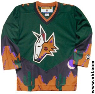
3. Phoenix Coyotes

I actually like the Coyotes normal jerseys, but these are just plain weird. The leaping coyote is such a far cry from what we've seen in Phoenix over the years (which is not always a bad thing). The striping on the sides doesn't look quite right, and the slanted coloring on the sleeves is strange.
Close, but no cigar.


2. Dallas Stars
Boring. Boring. Boring. It's white, it's straightforward, and it's bland. No piping on the bottom makes it look even more empty.


1. Atlanta Thrashers

What were they thinking? The color scheme is weird, has no relation whatsoever to their normal jerseys, and the writing is too high and too thin. Ugh.