Showing posts with label Dallas Stars. Show all posts

Jan 24, 2009

WHY THE GAME NEEDS FIGHTING

Last night, 20-year-old Garrett Klotz of the Philadelphia Phantoms had a seizure after a particularly long and bloody fight against a member of the Manchester Monarchs. This, plus the untimely death of Don Sanderson, who hit his head on the ice after a fight, and the argument about whether fighting really belongs in hockey is wide open for discussion.

Despite these horrible situations, fighting should remain legal. Believe it or not, fighting actually keeps the players more safe out on the ice, and taking that away would make for more cheap shots and probably more serious injuries. When the Dallas Stars visited the Boston Bruins on November 1, Dallas agitators Steve Ott and Sean Avery (especially Ott though) took cheap shot after cheap shot on Bruins players. He went after the knee of Stephane Yelle, and then backed into Milan Lucic's knees, clearly trying to hurt either one of them. So how did Boston respond? Well, Ott refused to fight, so enforcer Shawn Thornton fought Kris Barch. Andrew Ference fought Avery. In fact, just about all the Bruins were ready to drop the gloves to defend their teammates. And they did it all legally. Had fighting been outlawed in the game, the only way for them to reply to Ott's antics would be to go after him illegally. Maybe they would have hit him low, like he did to them. Maybe a shot after the whistle. Who knows? But what we do know is that fighting let the players police themselves and nobody got hurt.

Taking fights out of the game would lead to more Ulf Samuelsson-Cam Neely situations. And I don't think anybody wants that.

Jan 22, 2009

THE 5 WORST ALTERNATE JERSEYS IN THE NHL

We've already looked at the five best alternate designs, now let's go over the five worst.

5. Ottawa Senators

My main problems with this one are the sleeves and the sides. Too many stripes and color changes going every which way. There is simply too much going on, and the piping on the shoulders looks ridiculous. I actually don't mind the slant of the writing, but the rest ruins a logo with potential.


4. Pittsburgh Penguins

The Pens have been black, gold, and (I guess) white for so long that anything else just doesn't work. The ugly light blue, coupled with the yellow of the normal logo in the center clashes badly, and the black lines at the base of the sleeves look strange.


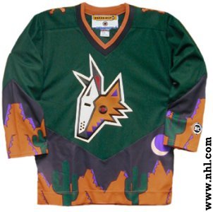
3. Phoenix Coyotes

I actually like the Coyotes normal jerseys, but these are just plain weird. The leaping coyote is such a far cry from what we've seen in Phoenix over the years (which is not always a bad thing). The striping on the sides doesn't look quite right, and the slanted coloring on the sleeves is strange.
Close, but no cigar.


2. Dallas Stars
Boring. Boring. Boring. It's white, it's straightforward, and it's bland. No piping on the bottom makes it look even more empty.


1. Atlanta Thrashers

What were they thinking? The color scheme is weird, has no relation whatsoever to their normal jerseys, and the writing is too high and too thin. Ugh.