Showing posts with label alternate jerseys. Show all posts

Jan 22, 2009

THE 5 WORST ALTERNATE JERSEYS IN THE NHL

We've already looked at the five best alternate designs, now let's go over the five worst.

5. Ottawa Senators

My main problems with this one are the sleeves and the sides. Too many stripes and color changes going every which way. There is simply too much going on, and the piping on the shoulders looks ridiculous. I actually don't mind the slant of the writing, but the rest ruins a logo with potential.


4. Pittsburgh Penguins

The Pens have been black, gold, and (I guess) white for so long that anything else just doesn't work. The ugly light blue, coupled with the yellow of the normal logo in the center clashes badly, and the black lines at the base of the sleeves look strange.


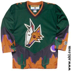
3. Phoenix Coyotes

I actually like the Coyotes normal jerseys, but these are just plain weird. The leaping coyote is such a far cry from what we've seen in Phoenix over the years (which is not always a bad thing). The striping on the sides doesn't look quite right, and the slanted coloring on the sleeves is strange.
Close, but no cigar.


2. Dallas Stars
Boring. Boring. Boring. It's white, it's straightforward, and it's bland. No piping on the bottom makes it look even more empty.


1. Atlanta Thrashers

What were they thinking? The color scheme is weird, has no relation whatsoever to their normal jerseys, and the writing is too high and too thin. Ugh.

THE TOP 5 ALTERNATE JERSEYS IN THE NHL

The NHL's decision to create new alternate jerseys for some of it's teams was certainly an interesting one. Teams change jersey designs so often, it seems like every couple of weeks a new logo appears. By creating these new third jerseys the NHL has put a stop to teams unveiling new designs so often, and have in turn created some fantastic looking jerseys, and some of the most hideous uniforms you will ever see. Here are the five best looking alternates, with the five worst coming later on.

5. Boston Bruins
Thankfully, the B's decided to abandon the mustard yellow jerseys and get back to the black alternates. I love the walking bear logo, which appears to be a more modernized version of the team's old logo.


4. San Jose Sharks
The Sharks decided not to completely overhaul the "shark biting hockey stick" logo that they have used ever since the team's creation, but slight tweaks make their new alternate a keeper. The draw string up top give the jersey an old-timey feel, and the teal arm stripes look pretty sweet. I also like the interlocking SJ on the shoulders.


3. Edmonton Oilers
The Oilers are essentially just going back to their hay day with these new jerseys. While Wayne Gretzky, Mark Messier, and Grant Fuhr may not be walking through that door, Edmonton is trying to bring back some of the magic from those teams. I especially like the orange coloring at the bottom of the sleeves.


2. Chicago Blackhawks
These jerseys, that the 'Hawks unveiled at the Winter Classic, are pretty awesome looking. They actually use a combination of two different jerseys from the past, combining them into these beauties. I really like the circle with team name surrounding the main logo.


1. Buffalo Sabres
I've always been a big fan of the Sabres old jerseys. The black uniforms with the buffalo's head are pretty stupid looking, and the jerseys they've worn for the past two seasons just can't compare. I'm glad they are going back to their original look with these alternates. If only the Sabres would wear them every game...